
Understanding Investment Performance & Risk Metrics
A backtest hands you about sixteen numbers, and they answer four different questions — how much a strategy made, how painful the journey was, what the returns cost in risk, and how the strategy actually behaved. Reading them together is the skill.
What You’ll Learn
By the end of this article, you’ll understand:
- Why a backtest reports so many numbers, and what each group is for
- How CAGR differs from total return, and what neither one tells you
- Why the length of a drawdown can matter more than its depth
- What Sharpe, Sortino, win ratio and profit factor each add
- How to read trade count and holding period as evidence about a strategy
- Why no single metric — the Score included — can settle whether a strategy is any good
Sixteen numbers, four questions
Run a backtest and NiveshBuddy hands you roughly sixteen figures. Faced with that many, most people find the largest percentage, decide the strategy is good or bad, and move on.
The numbers resist this, because they are not sixteen answers to one question. They are answers to four, and the product groups them accordingly.
| Group | The question it answers |
|---|---|
| Growth | How much did the strategy make? |
| Risk & Drawdowns | How painful was the journey to that result? |
| Quality of Returns | What did those returns cost in risk taken? |
| Portfolio Behavior | What did the strategy actually do along the way? |
A strategy can look excellent on one group and poor on another, and that combination is usually the interesting part.
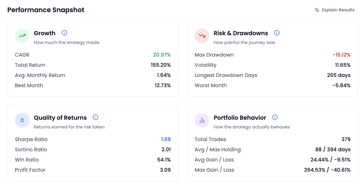
Everything below reads the figures from the backtest above. They belong to one strategy over one test window; a different strategy, or the same one over a different period, would produce entirely different numbers. Treat them as an example of how to read a results page, never as an indication of what a strategy might return.
Growth — how much it made
Three of the four figures here describe the same gain at different resolutions, which is why quoting one without the others is so easy and so misleading.
Total Return of 155.20% is the whole gain across the test window. It says nothing about how long that took, so it is unusable for comparison until you know the period.
CAGR of 20.97% is that same gain expressed as a smooth annual rate. It is the more comparable figure, and it carries a trap in its smoothness: it describes the rate that would have produced this result if returns had arrived evenly. They did not. The same backtest reports a best month of 12.73% and a worst of −5.84%, which is what "20.97% a year" actually looked like from the inside.
An investor expecting roughly 21% each year would have met several months that looked nothing like it and concluded something had broken. Nothing would have.
Avg. Monthly Return of 1.64% has the same property in miniature, and Best Month is a single observation — the friendliest number on the page and the least informative, since one exceptional month says little about the other fifty.
Risk — how painful the journey was
This group is the one most readers skip, and it is where a strategy is usually decided.
Max Drawdown of −15.12% is the deepest fall from a previous peak. Read it as a question rather than a statistic: would you have held on through a 15% decline without abandoning the strategy? If not, the return above the number is not available to you, because you would not have been there to collect it.
Volatility of 11.65% measures how much the returns scattered around their average. It is not the same thing as loss — a strategy can be volatile and profitable — but it does describe how uncomfortable the ride was day to day.
Longest Drawdown Days of 265 is the most under-read figure on the whole page, and often the most important. It measures duration: the longest stretch spent below a previous high before recovering it. Depth and duration are different injuries.
Two ways a drawdown hurts
Depth
- Fell 15.12% below its peak
- Recovered afterwards
−15.12%
how far down it went
Duration
- 265 days below the previous high
- Roughly nine months
265 days
how long it stayed there
Nine months of watching a strategy sit below a level it once reached is a different experience from a sharp fall that recovers in three weeks, even when the percentage is identical. Duration is what makes people abandon a working strategy, and a results page that reports only depth would hide it.
Worst Month of −5.84% completes the picture: the single worst calendar month in the test.
Quality — what the returns cost in risk
Growth and risk read separately are two halves of an argument. This group joins them, which is why it is where most of the judgement lives.
Four figures that put return and risk in one number
Sharpe Ratio
- Return per unit of total volatility
- Treats upside and downside alike
1.69
in this backtest
Sortino Ratio
- Return per unit of downside volatility only
- Upside swings don't count against it
2.01
in this backtest
Win Ratio
- Share of trades that made money
- Says nothing about size
54.1%
in this backtest
Profit Factor
- Gross profit divided by gross loss
- Says nothing about frequency
3.09
in this backtest
Sharpe and Sortino answer the same question differently. Sharpe divides return by total volatility, treating a violent move upward as just as much "risk" as one downward. Sortino counts only downside movement. Sortino sitting above Sharpe — 2.01 against 1.69 here — is the ordinary case, and the gap is itself informative: a good share of this strategy's volatility was upward, which is the kind nobody objects to.
One NiveshBuddy-specific detail before you compare a Sharpe with a figure from anywhere else: the product calculates it without a risk-free rate, so it reads higher than the textbook version. The results page describes it in words on its own scale — strong from 1.5, good from 1, moderate from 0.5, weak below that — so the 1.69 here would be described as strong. Compare Sharpe figures within NiveshBuddy, not across tools.
Win Ratio and Profit Factor must be read together, and they are the clearest illustration on the page of why one metric is never enough.
A win ratio of 54.1% sounds like a coin flip with a slight edge. A profit factor of 3.09 says gross profits across the test were about three times gross losses. Together they say what neither says alone: just over half the trades worked, and those that did more than paid for those that didn't.
Reverse it and you get a strategy worth being suspicious of — a 75% win ratio with a profit factor near 1.0 describes many small gains funding a few large losses. Either shape can be viable. Neither can be judged from one number.
Behaviour — what the strategy actually did
The last group is the least glamorous and the most practical: it describes the strategy's conduct rather than its outcome.
Total Trades of 379 carries the most real-world consequence, because every trade costs something a backtest may not fully model. A strategy trading several hundred times makes a different demand on you than one trading thirty, regardless of what either returned.
Avg / Max Holding of 88 / 394 days describes timescale, and doubles as a consistency check: if you designed a long-horizon strategy and the average holding is eleven days, something in the rules is not doing what you intended.
Avg Gain / Loss of 24.44% / −9.51% is profit factor made concrete — the average winner earned about two and a half times what the average loser cost. Max Gain / Loss of 264.53% / −40.61% shows the extremes, worth knowing because a single outsized winner can carry an entire backtest's headline return, and that is a fragile thing to depend on.
Why one number is never enough
Every metric on the page can be made to flatter a strategy in isolation.
What each number hides on its own
A high CAGR
Says nothing about the path taken to get there, and a smooth annual rate is precisely what a real strategy does not deliver. Read it next to Max Drawdown and Longest Drawdown Days.
A shallow drawdown
May mean the strategy was well behaved, or may mean the test period never included a serious fall. Read it next to the length of the test window.
A high win ratio
Can describe many small gains funding a few large losses. Read it next to profit factor and average gain versus average loss.
A low trade count
Looks efficient, but a strategy that trades rarely has produced fewer independent observations, so its record rests on less evidence. Read it next to the holding period.
The habit worth building is to form a sentence, not pick a number. For the backtest above: this strategy grew at about 21% a year, spent as long as nine months below a previous high, earned considerably more on its winners than its losers across 379 trades, and held positions for about three months on average. That sentence is checkable and arguable. "It returned 155%" is neither.
None of this establishes that a strategy will behave the same way again. These figures describe one rule set measured against one stretch of history, and the most a good reading of them can do is tell you what you would have had to endure — not what you will.
The summaries above the snapshot
The Performance Snapshot sits on its own tab. Before you reach it, the results page has already summarised the same backtest twice — and both summaries are built from the figures this article has walked through.
- The KPI cards across the top: Score, CAGR, Benchmark, Alpha, Max DD and Sharpe. The benchmark is the Nifty 50 over the same window, and Alpha is the gap between the two — so "compared to what?" is answered before you scroll.
- Score is shown out of 100 with a band beside it (Good, Excellent and so on). It combines return quality, risk control, risk-adjusted return and consistency into one figure — useful for sorting a list, and subject to every warning above about single numbers.
- The Key takeaway card at the top of the Overview tab puts the result into words: a one-line headline, what ₹5 lakh became against the same amount in the Nifty 50, the worst fall and its length, and the Sharpe in words.
Treat both as an index to the snapshot, not a substitute for it. They describe one backtest over one window, they are not a recommendation, and neither knows your risk tolerance. One more thing they inherit: every figure assumes the Transaction Cost set for the backtest, which is zero unless someone changed it. The trade log's optional net-return column shows what costs would have taken.
Common misconceptions
- "The strategy with the highest CAGR is the best one." It is the one that performed best in its test period. Whether that reflects a durable idea or a close fit to that period is a separate question the number cannot answer.
- "A 20% CAGR means about 20% a year." It means the smoothed equivalent. The same backtest reporting 20.97% also reports a −5.84% month. Returns arrive unevenly, and the average is a summary of the path, not a description of it.
- "Max drawdown is the worst that can happen." It is the worst that did happen inside the test window. A different period could be worse, and no historical figure sets a floor under future outcomes.
- "A high win ratio means a reliable strategy." It means trades finished positive more often than not. Without profit factor and average gain versus loss, it says nothing about whether those wins were big enough to matter.
- "Sharpe below some threshold means reject it." Ratios are comparative, not absolute — most useful comparing strategies tested over the same period, and nearly meaningless as a pass mark.
- "More trades means the strategy is working harder." More trades means more cost and more exposure to the gap between a backtest and reality. Activity is not evidence of edge.
Key takeaways
- A results page answers four questions, not one — how much it made, how painful the journey was, what the returns cost in risk, and how the strategy behaved.
- Total return needs a time period to mean anything; CAGR supplies one but smooths away the path, which is the part you have to live through.
- Longest Drawdown Days is the most under-read figure on the page — nine months below a previous high is what actually makes people abandon a working strategy.
- Sharpe counts all volatility, Sortino only downside; Sortino sitting above Sharpe says a good share of the movement was upward.
- Win ratio and profit factor are meaningless apart — together they describe whether the winners were large enough to pay for the losers.
- Trade count and holding period are consistency checks: they tell you whether the strategy did what you designed it to do.
- Judge a strategy by forming a sentence from several metrics, not by picking the largest number on the page.
- The Score and the Key takeaway summarise these same figures for one backtest; NiveshBuddy's Sharpe has no risk-free rate, so compare it only within the product.