
Evaluating & Comparing Investment Strategies
Comparing strategies starts with a question most people skip: are these two results even measuring the same thing? Then what to do when the metrics disagree — which they usually will.
What You’ll Learn
By the end of this article, you’ll understand:
- Why you compare backtest results, not strategies
- How to tell whether two results are comparable at all
- What the trophy markers do and do not mean
- Why the highest CAGR does not answer "which is better"
- How comparing two runs of one strategy isolates a single rule
- Which metrics deserve most weight, and for whom
What you are actually comparing
You are never comparing two strategies. You are comparing two backtest results — and a result is a strategy plus a test window, a starting amount and a cost assumption. Change any one of those and the numbers stop describing the same experiment.
That distinction sounds pedantic until it costs you a decision. Two strategies whose rules differ in one small way can produce results that look worlds apart, purely because one was tested through a stretch of market the other never saw, or charged for trading when the other did not.
NiveshBuddy's Compare Results page puts up to three results side by side, and there are two ways to reach it:
- Different strategies — from My Strategies,
Compare Strategiesputs the page into a selection mode; tick up to three and pressCompare Selected. - Different runs of the same strategy — from a strategy's Backtest History
tab, tick two or three runs and press
Compare selected. This is the more precise of the two, for reasons the last part of this article makes clear.
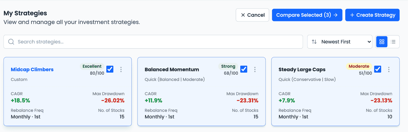
The example throughout uses three hypothetical strategies — Steady Large Caps, Balanced Momentum and Midcap Climbers — chosen to show how to read the page, not as strategies to copy.
First question: are they comparable?
Before weighing a single metric, establish that the results describe the same kind of thing. The page asks this before you do.
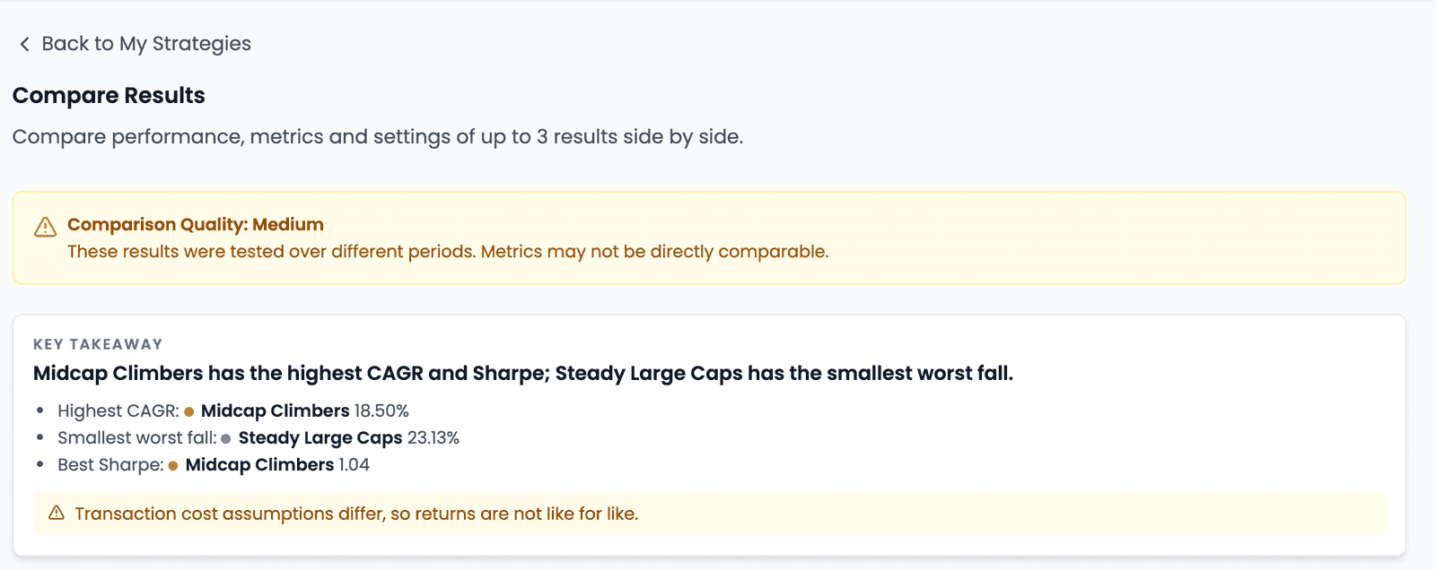
A Comparison Quality banner sits above everything else. Here it reads
Medium, with the reason attached: "These results were tested over different
periods. Metrics may not be directly comparable."
That is not boilerplate. Look at what it is describing:
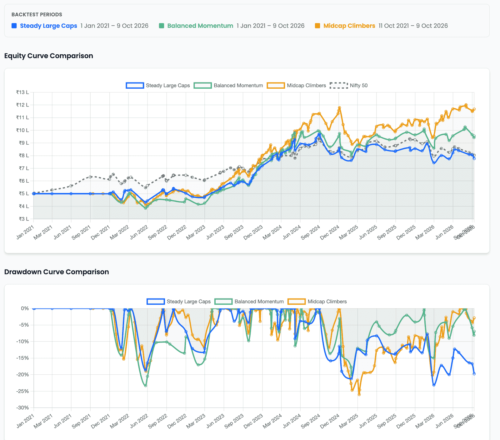
Two of these strategies were tested from 1 Jan 2021; Midcap Climbers only from 11 Oct 2021. So its Total Return of +133.44% had about five years to accumulate while the others had nearly six. Cumulative figures such as Total Return suffer worst from that. Rate-based ones such as CAGR, Sharpe and volatility survive better, because they are already normalised — but they still describe partly different market conditions, which is a subtler problem and not one the maths removes.
The Key takeaway card adds a second caveat the banner does not: "Transaction cost assumptions differ, so returns are not like for like." Midcap Climbers was tested with a 0.1% cost on every buy and sell; the other two at zero. So the one strategy that paid for its trades is being compared with two that traded for free.
Both caveats point the same way: before reading any row, notice which differences are in the strategies and which are in the tests.
The table nobody wins
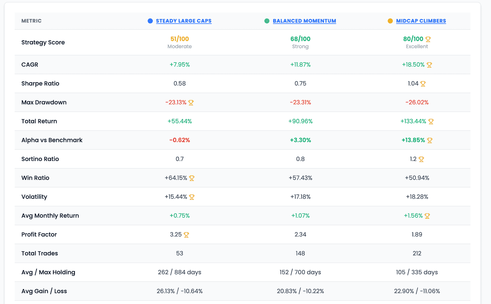
Performance Metrics puts fifteen metrics side by side and marks the leading value in each row with a trophy. Here the marks fall seven to Midcap Climbers, four to Steady Large Caps, and none at all to Balanced Momentum.
Two things about that are worth slowing down for.
Four rows carry no trophy at all — Total Trades, Avg / Max Holding, Avg Gain / Loss and Max Gain / Loss. Those are precisely the metrics where neither a higher nor a lower value is better. More trades is not better than fewer; a longer holding period is not better than a shorter one. The product declines to name a winner exactly where naming one would be meaningless, and that tells you how to read the other eleven.
A trophy can be marked on a row that is not comparable. The Total Return row carries one, even though the banner at the top of the same page has already said these were tested over different periods. The marker reports the largest value in the row. It is not checking whether the row was a fair fight.
A trophy marks a value, not a strategy
Nothing on this screen says which strategy is better, and the split across rows is the evidence. Midcap Climbers leads on returns and risk-adjusted returns. Steady Large Caps leads on the smallest drawdown, the highest win ratio, the lowest volatility and the best profit factor. Balanced Momentum leads on nothing, and sits between the two on almost everything.
Add the trophies up and you have counted rows, not made a decision. Which of those rows matters is a question about you, and the screen has no way of knowing the answer.
Reading rows that disagree
Metrics disagreeing is the normal case, not a fault in the comparison. Each answers a different question, so the useful move is to know which question you are actually asking.
| Metric | The question it answers | Weight it most if |
|---|---|---|
| CAGR · Total Return | How much did it grow? | You are comparing against a long horizon and can sit through the path |
| Max Drawdown | How far down did it go? | You know you would abandon a plan partway through a deep fall |
| Volatility | How bumpy was the ride? | Steadiness matters to you more than the destination |
| Sharpe · Sortino | How much return per unit of risk taken? | You want the two questions above weighed against each other |
| Win Ratio · Profit Factor | How often it won, and how much winners beat losers | You care whether returns came from many small wins or a few large ones |
| Total Trades · Avg Holding | How much activity does this require? | You pay real costs, or you have limited time to act on signals |
| Alpha vs Benchmark | How much came from the strategy rather than the market? | You could get the market return more cheaply another way |
Read two of these strategies against each other and the trade-off is plain. Midcap Climbers grew at 18.50% a year against 7.95% for Steady Large Caps, and earned more per unit of volatility (Sharpe 1.04 against 0.58). But Steady Large Caps fell less at its worst (−23.13% against −26.02%), won more often (64% of trades against 51%), and needed a quarter of the activity — 53 trades against 212, held for 262 days on average against 105.
An investor who would abandon a plan in a deep fall, or who pays real costs on every trade, can reasonably weigh that very differently from one chasing growth. Neither reading is wrong. This is why the highest CAGR is not the answer: picking on CAGR alone means accepting whatever the other rows say without having looked at them.
The catalogue of metrics is not the point. Choosing which two or three you could not compromise on, before you open the comparison, is.
Which rule caused the difference?
A performance gap always traces back to a configuration difference. The Settings section at the bottom of the page is where you find it.
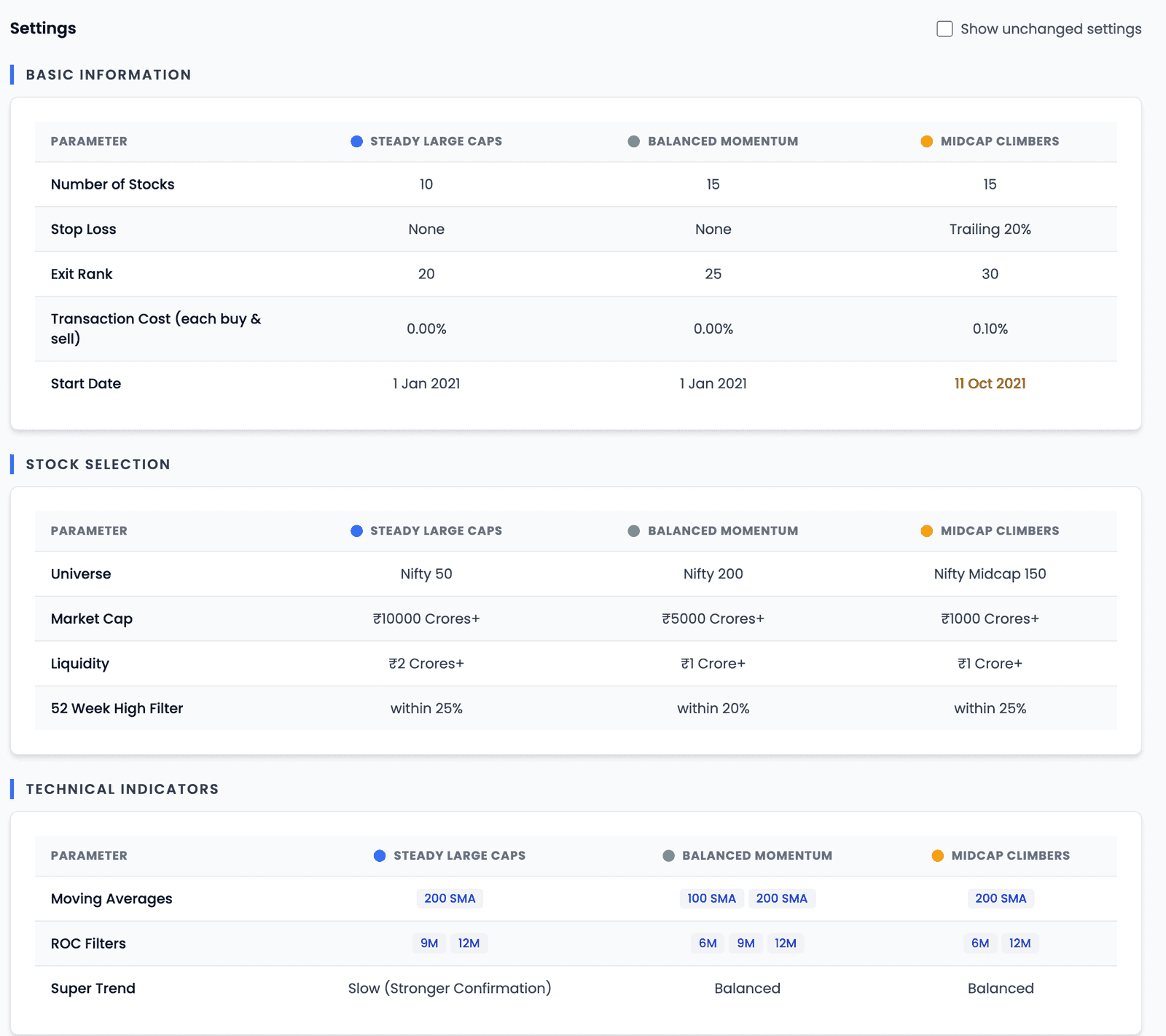
Settings opens showing only the rows where the results differ; tick Show unchanged settings to see the rest. Across these three strategies, almost everything survives — holdings, stops, exit rank, universe, size and liquidity floors, moving averages, ROC windows. Only a handful of rows were identical and hidden. Three strategies built separately differ everywhere, so no single row can be credited with the gap between them.
That is the limit of comparing different strategies, and it is where comparing runs of the same strategy earns its place. Midcap Climbers was backtested twice: once with an Exit Rank of 25, then customized to 30 and run again. Compare those two runs from its Backtest History, and the Settings section collapses to a single row:
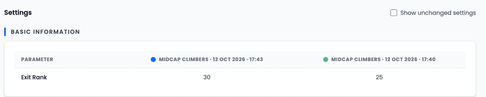
Now the cause is not in doubt. Widening the Exit Rank from 25 to 30 let holdings drift further before being sold: the run made 212 trades instead of 233, and its CAGR moved from 17.83% to 18.50%. Same universe, same window, same cost — so whatever changed came from that one rule. (Whether a difference that size is meaningful, or simply what one window happened to reward, is a separate question — one test period is one sample.)
There is no Comparison Quality banner on this page at all, because both runs used the same period. When two results share their window and their cost, the page has nothing to warn you about, and every row is a fair fight.
A procedure you can repeat
Comparing results, in order
- Are they comparable?Same window and same cost assumption — the banner and the Key takeaway flag both
- Where do they disagree?The rows that split are informative; the rows that agree are not
- Which rule caused it?Settings shows only what differs — runs of one strategy narrow it to one row
- What are you optimising for?Decide which metrics you could not compromise on — ideally before you look
Which metrics should matter to you
There is no ranking of metrics that holds for everyone, which is why this article does not offer one. What there is instead is a fairly reliable way to find your own.
Start from how you would behave, not from what you would like to earn. If a 25% fall would make you abandon the plan, then Max Drawdown and volatility outrank CAGR for you, however that looks on paper — because a strategy you stop following returns nothing at all.
Then account for what the backtest did not charge you. Transaction cost commonly sits at zero in a backtest — two of the three results here assumed it — so a strategy with 212 trades and one with 53 can look equally cheap to run. If you pay real costs, Total Trades stops being a curiosity and becomes a line item, and the fair comparison sets the same cost on every result.
Finally, treat one window as one sample. Every figure on the comparison page describes a single stretch of history. A result that survives several different periods is telling you something more durable than one that shone in a single favourable run — and testing that is a separate exercise from reading this screen.
Comparisons help evaluate rules-based approaches against the evidence available. Historical results do not guarantee future performance, and which strategy you run remains your decision.
Key takeaways
- You compare backtest results, not strategies — a result is a strategy plus a window, a starting amount and a cost assumption.
- Compare Results takes up to three results: different strategies from My Strategies, or runs of one strategy from Backtest History.
- Establish comparability first: the Comparison Quality banner flags different periods, and the Key takeaway flags different cost assumptions.
- Cumulative figures such as Total Return suffer most from mismatched windows; rate-based ones such as CAGR and Sharpe survive better but still describe different conditions.
- A trophy marks the leading value in a row, not the better strategy — and it can appear on a row the page has already warned is not comparable.
- Four rows carry no trophy at all, because more trades or a longer holding period is neither better nor worse.
- Metrics disagreeing is the normal case; decide which two or three you cannot compromise on before you compare.
- Settings shows only what differs. Across different strategies nearly everything does; across two runs of one strategy, it narrows to the rule you changed.
- Weight metrics by how you would behave, not by what you would like to earn: a strategy you stop following returns nothing.
- One test window is one sample, and robustness across periods is a separate question from anything this screen shows.